PyQGIS scripts are great to automate spatial processing workflows. It’s easy to run these scripts inside QGIS but it can be even more convenient to run PyQGIS scripts without even having to launch QGIS. To create a so-called “stand-alone” PyQGIS script, there are a few things that need to be taken care of. The following steps show how to set up PyCharm for stand-alone PyQGIS development on Windows10 with OSGeo4W.
An essential first step is to ensure that all environment variables are set correctly. The most reliable approach is to go to C:\OSGeo4W64\bin (or wherever OSGeo4W is installed on your machine), make a copy of qgis-dev-g7.bat (or any other QGIS version that you have installed) and rename it to pycharm.bat:
Instead of launching QGIS, we want that pycharm.bat launches PyCharm. Therefore, we edit the final line in the .bat file to start pycharm64.exe:
In PyCharm itself, the main task to finish our setup is configuring the project interpreter:
First, we add a new “system interpreter” for Python 3.7 using the corresponding OSGeo4W Python installation.
To finish the interpreter config, we need to add two additional paths pointing to QGIS\python and QGIS\python\plugins:
That’s it! Now we can start developing our stand-alone PyQGIS script.
The following example shows the necessary steps, particularly:
Initializing QGIS
Initializing Processing
Running a Processing algorithm
import sys

from qgis.core import QgsApplication, QgsProcessingFeedback
from qgis.analysis import QgsNativeAlgorithms

QgsApplication.setPrefixPath(r'C:\OSGeo4W64\apps\qgis-dev', True)
qgs = QgsApplication([], False)
qgs.initQgis()

# Add the path to processing so we can import it next
sys.path.append(r'C:\OSGeo4W64\apps\qgis-dev\python\plugins')
# Imports usually should be at the top of a script but this unconventional
# order is necessary here because QGIS has to be initialized first
import processing
from processing.core.Processing import Processing

Processing.initialize()
QgsApplication.processingRegistry().addProvider(QgsNativeAlgorithms())
feedback = QgsProcessingFeedback()

rivers = r'D:\Documents\Geodata\NaturalEarthData\Natural_Earth_quick_start\10m_physical\ne_10m_rivers_lake_centerlines.shp'
output = r'D:\Documents\Geodata\temp\danube3.shp'
expression = "name LIKE '%Danube%'"

danube = processing.run(
    'native:extractbyexpression',
    {'INPUT': rivers, 'EXPRESSION': expression, 'OUTPUT': output},
    feedback=feedback
    )['OUTPUT']

print(danube)
QGIS 3.4 has recently become our new Long Term Release (LTR) version. This is a major step in our history – a long term release version based on the massive updates, library upgrades and improvements that we carried out in the course of the 2.x to 3x upgrade cycle.
We strongly encourage all users who are currently using QGIS 2.18 LTR as their preferred QGIS release to migrate to QGIS 3.4. This new LTR version will receive regular bugfixes for at least one year. It also includes hundreds of new functions, usability improvements, bugfixes, and other goodies. See the relevant changelogs for a good sampling of all the new features that have gone into version 3.4
Most plugins have been either migrated or incorporated into the core QGIS code base.
We strongly discourage the continued use of QGIS 2.18 LTR as it is now officially unsupported, which means we’ll not provide any bug fix releases for it.
You should also note that we intend to close all bug tickets referring to the now obsolete LTR version. Original reporters will receive a notification of the ticket closure and are encouraged to check whether the issue persists in the new LTR, in which case they should reopen the ticket.
If you would like to better understand the QGIS release roadmap, check out our roadmap page! It outlines the schedule for upcoming releases and will help you plan your deployment of QGIS into an operational environment.
The development of QGIS 3.4 LTR has been made possible by the work of hundreds of volunteers, by the investments of companies, professionals, and administrations, and by continuous donations and financial support from many of you. We sincerely thank you all and encourage you to collaborate and support the project even more, for the long term improvement and sustainability of the QGIS project.
On behalf of QGIS.ORG and the whole community, I’m would like to extend our thanks and congratulations to all the local volunteers who helped to make the event happen, with special thanks to Luigi “Ginetto” Pirelli, who spearheaded the effort. The event, which included a full week of workshops, a user conference, and contributor meeting, marked another milestone in the history of QGIS.
It was possibly the largest meeting we have had to date. It especially gratifying seeing more diversity and new faces. Our inclusive and welcoming community has always been a point of pride and it was amazing seeing how newcomers easily and pleasantly integrating in the community, producing good and tangible results within just a few days.
Many decisions were made, many discussions were fruitfully concluded, many tortillas were eaten, plans were laid out. These events are critical for preparing the way for the future of the QGIS.ORG project.
Our heartfelt thanks to all who donated their time and intellect, and to the many donors and sponsors to make all this possible.
See you in Bucharest next August, for the 23rd QGIS meeting!
Ever wished QGIS had a way to insert dynamic, feature rich charts and graphs directly inside print layouts? If so, our latest crowdfunding campaign has you covered! This missing feature is a large gap in QGIS printing capabilities, so we’re planning on filling that gap by exposing the powerful QGIS “Data Plotly” plugin to allow these charts to be embedded inside your layouts, and allow them to be created and modified in a simple, interactive style.
If you’re not aware of the existing capabilities of the DataPlotly plugin, here’s a quick screencast which should get you excited about the possibilities here…
QGIS is already a reporting powerhouse, and we believe that linking DataPlotly with QGIS print layouts will boost the current functionality up an order of magnitude! To make it possible we need 8600€ pledged before 30 April 2019. North Road is collaborating on this campaign with our friends at Faunalia, and development work will be shared between the two consultancy firms.
You can help make this a reality by supporting the campaign or by sharing the page and increasing exposure to the campaign. Full details about the planned functionality and how to contribute are available at the campaign page.
We are really happy to announce the fifth and (hopefully) last 1.0 release candidate in QField’s history! This means that QField 1.0 is closer than ever.
Thanks to all the feedback by the fantastic community we were able to fix plenty of bugs, address performance issues and even add some super cool new features.
New file selector
Among the new features, the most important is the flashy new file selector with favorite directories (long press on a folder to add it to the favorites and longpress on the favorites list to remove it) and an automatic list of the last three opened projects that will save you heaps of time while looking for your projects.
Another lifesaver is the newly added support for pasting text from the clipboard in the search bar. Finally, we added a smart and unobtrusive “rate this app” dialog to make it easier for you to give QField the ★★★★★ you always wanted to give it
You can easily install QField using the Playstore (https://qfield.org/get), find out more on the documentation site (https://qfield.org), watch some demo videos on our channel (https://qfield.org/demo) and report problems to our issues tracking system (https://qfield.org/issues). Please note that the Playstore update can take some hours to roll out and if you had installed a version directly from GitHub, you might have to uninstall it to get the latest playstore update.
We would like to thank the developers, documenters, testers and all the many folks out there who volunteer their time and effort (or fund people to do so). From the QGIS community we hope you enjoy this release! If you wish to donate time, money or otherwise get involved in making QGIS more awesome, please wander along to qgis.org and lend a hand!
QGIS is supported by donors and sustaining members. A current list of donors who have made financial contributions large and small to the project can be seen on our donors list. If you would like to become a sustaining member, please visit our page for sustaining members for details. Your support helps us fund our six monthly developer meetings, maintain project infrastructure and fund bug fixing efforts.
QGIS is Free software and you are under no obligation to pay anything to use it – in fact we want to encourage people far and wide to use it regardless of what your financial or social status is – we believe empowering people with spatial decision making tools will result in a better society for all of humanity.
We are pleased to announce the first public release of Input. Input is a Free and Open Source mobile application built on top of QGIS.
Why Input?
Collecting data is often an essential part of a geo-data management workflow. The problems we have tried to resolve with Input:
A mobile app: to collect the data. The app has an intuitive interface. Similar to Google Maps, you don’t need to read a whole bunch of documentation to be able to use the app.
Data synchronisation: a collaborative way of managing the data. We provide Mergin, a central storage, where data administrators can upload their data/projects for their users to change in the field. Changes made to the data through Input will be tracked and can be uploaded to Mergin. Likewise, data administrators can propagate changes to their users by updating the files on Mergin.
How to use Input?
You can set up your projects in QGIS. Input is based on QGIS, so it can read all data and services (e.g. Shapefile, Geopackage, TIF, WMS, XYZ tiles, WFS, etc) available in QGIS.
You can customise your forms and identify panel for the layers to be surveyed. Input uses Display tags and Map Themes to better view the data. For more information, see QGIS project configuration of the user documentations.
You can then upload your data and projects to Mergin and share them with your users. Permissions to users to read/write the project can be granted through Mergin.
Input can be installed from Google Play Store. Users will be able to log in to the their Mergin account and download the projects.
Within the app, users can capture geometries (e.g. points, lines and polygons). Capturing of data can be free-hand, or it can be achieved by streaming the GPS locations and generating vertices.
Forms can be easily edited based on the widgets users have set up in the QGIS project. For example, you can add photos, notes, dates, etc to the digitised features.
Input keeps track of changes and you can upload the changes back to Mergin from within the app.
Feedback
If you’d like to use Input and Mergin within your enterprise environment, please contact us so that we can provide you with a dedicated hosting and no data limit.
We are incredibly pleased and proud of just having released such a jewel and are convinced that, thanks to all its features and conscious design choices, QField will make your field digitizing work much more efficient and pleasant.
Packed with loads of useful features like online and offline features digitizing, geometry and attributes editing, attribute search, powerful forms, theme switching, GPS support, camera integration and much more, QField is the powerful tool for those who need to edit on the go and would like to avoid standing in the swamp with a laptop or paper charts.
Let’s see what makes QField probably* the best mobile GIS in the world.
Work efficiently
QField focuses on efficiently getting GIS field work done and combines a minimal design with sophisticated technology to get data from the field to the office in a comfortable and easy way.
Fast and reactive
Thanks to the underlying QGIS engine and a lot of optimizations, QField is powerful and snappy. Even with complex projects, QField is a joy to work with.
Easy handling
Conscious design choices and a continuous focus on a minimal user interface drive QField’s development. This allows us to deliver a product wich is uncluttered and extremly user-friendly
Quickly digitise
Allowing a seamless digitizing experience is a paramount goal of QField. Thanks to a cleverly designed adaptive user interface and specific features like real-time attribute checks and snapping support, QField allows its users to be extremely time efficient.
Unmatched feature set
To be the best, you need to be clever but also skillful.
QField’s efficiency is matched only by its featureset that allows its users to make the most out of their fieldwork time.
Powerful cartography combined with full text search
The beauty of GIS is that maps are dynamic. Layers can individually be shown and hidden and information can be presented more or less prominently based on the task at hand. QField supports the endless styling possibilities offered by QGIS and thanks to a well placed theme switcher you can change the looks of the entire project with a single click. For even more customizability, QField allows hiding and showing layers by simply long-pressing on the layer name.
Furthermore, QField boasts a fully configurable attribute text search that will allow you to geolocate and edit that exact object you were looking for.
Geometry editing
Editing Geometries on the field is probably the most complex task an operator has to deal with. QField simplifies this process through an adaptive toolbar that appears only when necessary, snapping support and a crosshair digitizer.
Thanks to these enhancements, QField allows reducing the error rate significantly.
Support for high precision GNSS
Simple internal GPS accuracy might be enough for basic projects but cadastral surveying and other high accuracy digitizations have much higher requirements. QFields natively listens to the Android location services so it can take advantage of the best location provided by external devices.
Generate PDF
Thanks to QField’s native support for generating PDFs based on QGIS’s print layouts, your on the fly daily report map is just one click away.
Intuitive project chooser
When dealing with multiple projects, quickly being able to switch between them is key. QField comes with a beautiful file selector with favorite directories (long press on a folder to add it to the favorites and long press on the favorites list to remove it) and an automatic list of the last three opened projects that will save you heaps of time while looking for your projects.
Your data – Your decisions
QField does not impose any constraint on the data model, it is your data and you decide what they should look like and what values are acceptable. QField can enforce constraints for you and you can choose among various type of widgets to represent your data. QGIS will preconfigure some field types automatically, all you’ll have then to do is tweak the settings if you want and your project is ready for mobile prime time. Our documentation has all the information you need.
Extends your Geo Data Infrastructure seamlessly
QField uses QGIS to set up maps and forms so it automatically supports a wide variety of data formats. Thanks to this, you can comfortably prepare your project once and then deploy it everywhere. And since QGIS also has a server component, your project can be served on a WebGIS with the very same beautiful looks.
In fact you can see this exact infrastructure up and running under demo.qfield.org and with the “online_survey.qgs” project included in the QField demo projects.
Synchronize with WiFi, Cable or Network
You can synchronize your project and data (in case you are not using a centralized online database) using various methods thanks to our QFieldSync plugin.
Future cloud integration
In the near future we will add a cloud synchronization functionality, so that you will be able to seamlessly manage your project online and have them automatically deployed to your devices.
Installing and contributing
You can easily install QField using the Playstore (qfield.org/get), find out more on the documentation site (qfield.org), watch some demo videos on our channel (qfield.org/demo) and report problems to our issues tracking system (qfield.org/issues). Please note that the Playstore update can take some hours to roll out and if you had installed a version directly from GitHub, you might have to uninstall it to get the latest Playstore update.
We would like to thank our fantastic community for all the great translations, documentations, bug reports and general feedback they gave us. Thanks to all this, we were able to fix plenty of bugs, address performance issues and even add some super cool new features.
Development and deployment services
As masterminds behind QField and core contributor to QGIS, we are the perfect partner for your project. If you want to help us build a better QField or QGIS, or if you need any services related to the whole QGIS stack, don’t hesitate to contact us.
OPENGIS.ch
OPENGIS.ch helps you setting up your spatial data infrastructure based on seamlessly integrated desktop, web, and mobile components. We support your team in planning, developing, deploying and running your infrastructure. Thanks to several senior geodata infrastructure experts, QGIS core developers and the makers of the mobile data acquisition solution QField, OPENGIS.ch has all it takes to make your project a success. OPENGIS.ch is known for its commitment to high-quality products and its continuous efforts to improve the open source ecosystem.
If you’ve been following our latest updates, you’ll be well aware that North Road and Faunalia are running a crowd funding campaign to add rich charting and graph functionality to QGIS’ Print Layout designer. This missing feature is a large gap in QGIS printing capabilities, so we’re planning on filling that gap by exposing the powerful QGIS “Data Plotly” plugin to allow these charts to be embedded inside your layouts, and allow them to be created and modified in a simple, interactive style. And thanks to a large group of generous backers, the campaign is off to a fantastic start!
Accordingly, we’d like to take the opportunity to showcase some of the current plot styles available from the QGIS DataPlotly plugin, all of which will be possible to insert into your print layouts if the campaign is successful. Let’s start with the default chart option – a simple scatter plot:
In this screenshot we see a scatter plot of Educational Usage vs Distance from City for a network of railway stations. We’ve left most settings at their default in order to illustrate that even out-of-the-box, the charts look great! They’ll fit right alongside your map masterpieces in your print layouts and won’t look out of place. It’s also important to note that the above screenshot demonstrates the current interactive canvas mode for the DataPlotly plugin. If this campaign is successful, the chart designer shown above will be available directly inside the QGIS Print Layout designer window. Users will be able to drop new charts into their layouts, and then edit the properties of those charts in a interactive manner. Exciting stuff indeed!
So what other plot styles are currently available in DataPlotly? Here’s a quick showcase of what’s hopefully in the future for QGIS’ print layouts…
Box plots
Bar plot
Histograms
Pie Charts
2D Histogram
Polar Plots
Ternary Plots
Contour Plots
Violin Plots
These plots can already be created from your map canvas using the version of DataPlotly available from the standard QGIS plugin repository, so we encourage you to download the plugin and have a play, and start to get a feel for the flexibility and power having access to these charting options will bring to your print layouts!
You can help make this feature a reality by supporting the campaign or by sharing the page and increasing exposure to the campaign. Full details about the planned functionality and how to contribute are available at the campaign page.
Currently there are a number of ongoing crowdfunding initiatives for improvements in QGIS that need your support:
1. Diagrams in print layouts, atlas and reports: the popular data plotly plugin for interactive, exploratory charts and diagrams should be enhanced to support embedding in print layouts, atlas serial prints and reports. Details can be found at the North Road campaign website. This is a joint effort of companies Faunalia and North Road. Funding goal: € 8’600 (1’780 collected as of April 2, 2019)
2. Cartography proposal: selective masking of symbol levels behind labels and map symbols. Inspired by the high-quality topographic maps of Swisstopo. Details can be found at the Oslandia campaign website. Funding goal: € 20’000 (8’000 collected as of April 2, 2019)
3. GeoPDF-Export: Export of georeferenced PDF files, with the possibility to measure, query coordinates, toggle map layers and query feature attributes. The project is partitioned into several work packages. This is a joint effort of Even Rouault and North Road on request of several Austrian local government agencies. For more details, please contact Johannes Kanonier of the Landesvermessungsamt Vorarlberg. Funding goal: € 30’800 (24’400 collected as of April 2, 2019)
4. SLYR: Converter for ESRI LYR and MXD-Files. Project is partitioned in several work packages for the conversion of ESRI styles to QGIS styles, MXD-Files into QGIS project files and ESRI layouts to QGIS layouts. Please find more details at the SLYR website of North Road.
Thank you for your support in making these projects a reality!
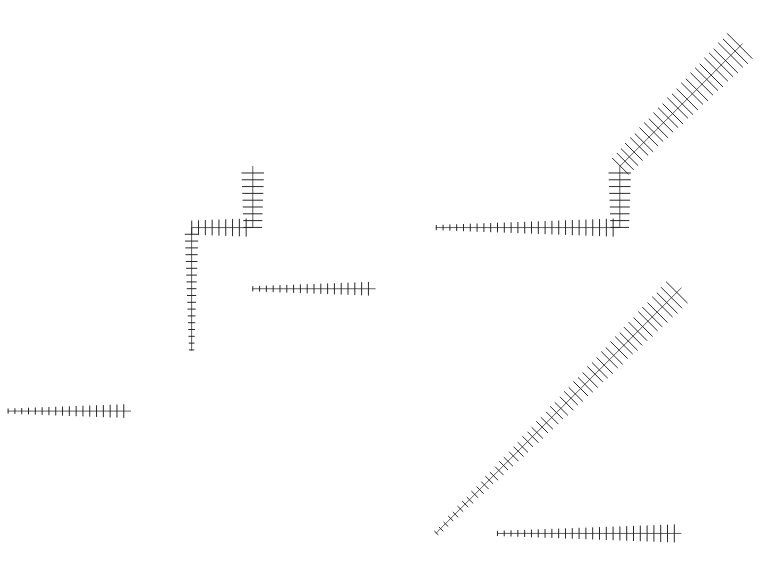
Thanks to an anonymous corporate sponsor, we’ve recently had the opportunity to add a new Hashed Line symbol type for QGIS 3.8. This allows for a repeating line segment to be drawn over the length of a feature, with a line-sub symbol used to render each individual segment.
There’s tons of options available for customising the appearance and placement of line hashes. We based the feature heavily off QGIS’ existing “Marker Line” support, so you can create hashed lines placed at set intervals, on line vertices, or at the start/end/middle of lines. There’s options to offset the lines, and tweak the rotation angle of individual hashes too. Added to QGIS’ rich support for “data defined” symbol properties, this allows for a huge range of new symbol effects.
E.g. using a data defined hash length which increases over the length of a feature gives us this effect:
Or, when using a complex line sub-symbol for rendering each hash, we can get something like this:
Or even go completely “meta” and use a hashed line sub symbol for the hash line itself!
With the right combination of symbol settings and QGIS draw effects you can even emulate a calligraphic pen effect:
Or a chunky green highlighter!
This same corporate sponsor also funded a change which results in a huge improvement to the appearance of both rotated hashed lines and marker lines. Previously, when marker or hash lines were rendered, the symbol angles were determined by taking the exact line orientation at the position of the symbol. This often leads to undesirable rendering effects, where little “bumps” or corners in lines which occur at the position of the symbol cause the marker or hash line to be oriented at a very different angle to what the eye expects to see.
With this improvement, the angle is instead calculated by averaging the line over a specified distance either side of the symbol. E.g. averaging the line angle over 4mm means we take the points along the line 2mm from either side of the symbol placement, and use these instead to calculate the line angle for that symbol. This has the effect of smoothing (or removing) any tiny local deviations from the overall line direction, resulting in much nicer visual orientation of marker or hash lines.
It’s easiest to show the difference visually. Here’s a before image, showing arrow markers following a line feature. Pay specific attention to the 3rd and last arrow, which seem completely random oriented due to the little shifts in line direction:
With new smoothing logic this is much improved:
The difference is even more noticeable for hashed lines. Here’s the before:
…and the after:
Suffice to say, cartographers will definitely appreciate the result!
Lastly, we’ve taken this new hash line feature as an opportunity to implement automatic conversion of ESRI hash line symbols within our SLYR ESRI to QGIS conversion tool. Read more about SLYR here, and how you can purchase this tool for .style, .lyr and .mxd document conversion.
We are very happy to announce that QGIS 3.4.6 LTR is now OGC certified as a reference implementation :
The OGC certification program gives a third party validation that the a web service is compliant with the standard.
The certification process requires manual work, so we will only certify on version for each LTR. This was not enough, so we build a OGC CI test platform that is checking compliance every night for WMS and WFS, so that you can check by yourself any specific version commit.
However WMS 1.3 is only the basics, if you rely on other services like WFS, WCS, or advanced capabilities like Raster or Vector Elevation, we are looking for supporters!
As the future is almost now If you want QGIS to be on the cutting edge with the upcoming WFS3, a JSON-REST modern version of WFS, please get in touch. We’d love to push this both into QGIS server and Desktop.
We often have QGIS project files that are part of a customer project. To be able to manage versions of these project files or have multiple people working on it, they are managed inside a git repository.
This is however not easy, because with every save of a project file, thousands of lines change, even if the real change is minimal. Like a change of a layer name.
Current situation
This blows up the git repository for no reason. And worse: it makes it impossible to review changes, because the signal to noise ratio is horrible.
OPENGIS.ch has just released a shiny jewel to make your life easier. The Trackable QGIS Projects plugin will automatically rewrite the saved project into a much more stable format.
Understandable changes thanks to the trackable QGIS plugin
Just download the plugin, install it and you are done. No user interface available, no configuration needed.
We are launching the #MyQField challenge. Follow us on Twitter and show us how you use @QFieldForQGIS by tagging your tweets with #MyQField and #dataisoutside. The tweet with most likes and retweets by 24.4.19 wins the training!
We are extremely pleased to announce the QGIS on the road tour with three free events this spring all over Switzerland. Limited places available so act fast reserve your place for the location you want.
Telling the story of Ms Maya Mielina, a retired GIS analyst and passionate beekeeper, our QGIS experts will show you features that you might not even have imagined existed in QGIS and that will allow you to dramatically increase your efficiency.
The format of the event is not that of a classic workshop but rather a prolonged presentation of extremely useful features. To keep the presentation interesting we will not focus on details or give a step by step tutorial, instead, will give you the gist of the idea thanks to our videos.
We advise you to take notes and to rewatch the published videos after the event.
One of the key features of Input mobile app, is the ability to upload/download your data from field through Mergin directly from the app.
For uploading/downloading your project, the only method was to use Mergin web interface. But with this plugin, users can interact with their projects and data directly from within QGIS desktop.
How to use the plugin?
You can install the Mergin plugin from QGIS plugin repository. Once it’s installed, you will see Mergin provider from your QGIS browser panel.
To use the plugin, you need to sign into your Mergin account. You can then easily:
Once you synchronise your changes to Mergin, the data will be available from your Input mobile app. To download the app for your Android device, click below:
If you’re a regular reader of this blog, it won’t surprise you to hear that we’re very excited about adding rich charting and graph functionality to QGIS’ Print Layout designer! Alongside our friends at Faunalia, we’re currently running a crowd funding campaign to make this a reality.
So, while the required funds weren’t raised within our original April 30 deadline, we’ve decided to extend this campaign by an additional 30 days in the hopes that the users and organisations from the wider QGIS community will jump onboard and pledge the remaining required funds.
This missing feature is a large gap in QGIS printing capabilities, so we’re counting on you to show your support and spread the word to your local user groups, QGIS users, and any organisations you know of who rely on QGIS and would love to see its inbuilt reporting capabilities levelled up!


 QGIS 3.4 has recently become our new Long Term Release (LTR) version. This is a major step in our history – a long term release version based on the massive updates, library upgrades and improvements that we carried out in the course of the 2.x to 3x upgrade cycle.